Tagged: Fabulous ladies

re:View – Maleficent, you can curse me any day

I have about as much love for fairy tales as I have issues with them. In their original, uncorrupted form, traditional fairy tales are simply the best stories in life – as long as you can read all the annoying gender bias as a product of its time. But in their re-imagined form nowadays, most fairy tales are so woefully misunderstood and gender-stereotyped it makes my feminist heart – not to mention my literary one – ache and riot.

Why? Four words: Every Bloody Disney Princess.

Because no matter how quirky, independent and courageous today’s princesses are created by the likes of Disney and Pixar, it still all boils down to the damsel in distress, the evil old witch (emphasis on ‘old’) and the bloody knight in bloody shining armour. Granted, today he often enters the scene as the incapable, clumsy, awkward nerd, but in the end he still always saves the day. And, frankly, the more these film-makers are pushing the point of the ‘strong, independent princess’ – and don’t even get me started on the ‘strong female character’ – the more patronising and agonising the result. “Look! She’s a modern princess. She’s brave, she’s going out there into the world, she can punch a guy’s lights out (preferably with a frying pan).” Well, for the first ten minutes, including the first catchy tune. And then she gets herself into trouble, because she knows nothing of the world and of course she needs to fall in love. Enter The Man. Standard plot ensues.

Over the last ten years or so I’ve been seeking refuge from all this pseudo-empowered bullshit in fiction that takes a different approach to the traditional fairy tale, such as Emma Donoghue’s gorgeously queer collection of re-told tales, Kissing the Witch, Angela Carter’s The Bloody Chamber and some of the works by Robin McKinley. Meanwhile, the movies have largely remained unbearable.

Then along comes Maleficent. Of course I went to see it, because Angelina. Spoilers after the break, so read on at your own risk.

Continue reading

One million reasons to not watch The X Factor vs. the one reason to watch it this year

Under normal circumstances, you wouldn’t find me within a mile of a TV set showing The X Factor or one of its similarly idiotic clones.

I say “under normal circumstances” because, although I passionately despise mass-produced pop music and the artificially made pop stars that generally serve as a vehicle to its producers, with the start of this year’s X Factor series, special circumstances seem to have arisen:

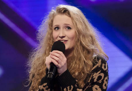
Janet Devlin.


Janet Devlin at her X Factor audition (before that awful makeover where some idiot stylist smoothed out her beautiful hair)

It’s a shame, really, that she’s having to try to get signed via the Simon Cowell machinery which – should she win – will probably land her captivating voice on an album full of soul-less production-line pop songs that will be heard and forgotten as soon as the Christmas sale is over. Because this incredibly talented, elf-like and utterly likeable young woman deserves a career of making her own music and being her own, beautiful self.

I sincerely hope that, no matter what the Cowell Commercialisation Cult churns out this time, Janet will be able to “get there” and be a successful artist on her own terms.

Check out the audition video and you’ll see what I mean.

And due to these special circumstances, I’m now spending my Saturday evenings watching a programme I’d vowed I would never support, and spending 35p a week on text vote.

Well. I’m a sucker for a good voice.

How to make Girl with a Pen’s day 100% better

One easy step: http://pausefacescully.blogspot.com/

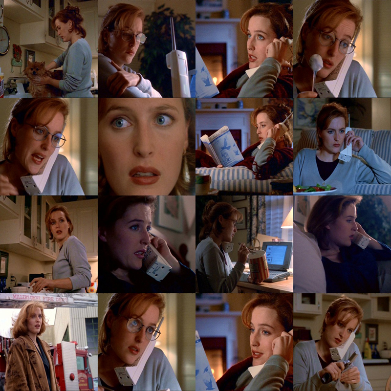
I can’t begin to tell you how delighted I was to find this blog. Not because of the images – I have at least 10 screenshots of Scully from every episode*, and better ones too. But it’s quite reassuring to know that I’m not the only nutcase out there who stops and screenshots her X-Files DVDs every few minutes purely for the enjoyment a trademark Agent Scully Face.


Click here to view in its full glory size

Now stop looking at me strange. Everybody is entitled to a little obsession in life. Or three.

* Or at least I had, until some fucktard junkie broke into my flat and stole my laptop along with everything else that was worth a penny…

WebTV: Orange vs Apple | Trailer of the year | How to lose fans and alienate people

Instead of the Picture of the Week (which, I admit, has become more of a picture of the quarter), let’s do a little round-up of videos that have kept me entertained this week.

1. Comedy: Nerdy Five a Day

Okay, Annoying Orange is a bit pointless and kind of…well, annoying – but trust me, walking down the fruit aisle in your supermarket will never be the same again.

Knife!

2. Movies: The Oscars are so yesterday (plus I can’t be bothered to blog about them)

Quite simply the smartest and funniest pop culture spoof I’ve seen in a long time.

3. Music: Retirement should be obligatory

I used to have a lot of respect for Meat Loaf’s work, up until he completely missed the point where it would have been appropriate to take a bow and say goodbye to the business (or at least to any attempts at singing live) a couple of years ago. And now along comes this first single from his new album, which seems to promise, above all things, that the story is set to get yet a bit sadder.

Cheesy pop song aside – WTF is this video?
a) A showcase of the latest collection of pimp suits
b) An episode of Scrubs gone very wrong
c) Police Academy 8 (gone equally wrong)
d) A desperate PR stunt aiming for media attention and a week or two in the album top 100

Feel free to throw in your own suggestions.

re:View – Nine (reasons why this much-anticipated film is one big, sad missed chance)

  1. Nine stars Sophia Loren, Judi Dench, Nicole Kidman, Penelope Cruz, Kate Hudson, Marion Cotillard, Fergie and Daniel Day-Lewis. That’s about as many grand names as you can fit on a movie poster. (With exception of the upcoming Valentine’s Day, maybe.) And that exactly is its curse, too. Packed with so much fame and talent, it has to be amazing. Otherwise it will just be “hmm, well, bit disapointing, don’t you think?” The missed chance here? Well, let me just say it wasn’t amazing.
     
  2. Despite the high density of talent, charisma and glamour on the screen, this film manages to be exceptionally bland. And “bland” is by no means a lazy writer’s comment. I’ve tried for the last two hours to come up with an adjective that describes the experience. Nine is definitely not amazing, great, cool, good, decent. But the thing is, it’s so…well, bland, that I can’t even call it bad. It’s just sort of neutral. Like the colours of the iconic Italy it’s trying to bring to life (not very successfully so).
     
  3. It suffers from a distinct lack of plot. I know, I know – that’s the point. The Maestro doesn’t have a clue what he’s doing when trying to make his new film. But we would also get that without the film itself demonstrating that it doesn’t have a clue as to what it is doing either.
     
  4. In a way following on from 3., the film is of course based on a musical. And musicals tend to get away with being a bit light on the storyline side, mainly because they’ve got all that singing and dancing and being glamorous and stuff. But there are also things that musicals aren’t very good at, one of them being the subtler notes and the more intimate acting. When a musical gets transformed into film, you’d kind of expect them to make use of the chances offered by the medium (as Chicago and Phantom , for example, have done rather impressively.) Nine just sort or randomly puts people into costumes and makes them burst out into song right in the middle of what otherwise could have been nicely done non-musical scenes.
     
  5. The characters are exceptionally lifeless. Except for the Maestro (Day-Lewis) maybe, but even in his case you get bored of all the eccentricity and torturedness after the first hour. And the women are basically just assorted puppets:
    • The loving, faithful, silently suffering little wife (Cotillard) loving and suffering so faithfully and silently that it just makes you wanna be sick.
    • The hyper-sexy, naive mistress (Cruz) being so over-the-top pouty and clingy that she’s almost comical – sadly without being the least bit funny.
    • The whore (Fergie) who was apparently the Maestro’s first temptation (and brings us the only really impressive musical number) but somehow remains shockingly unattractive in all her aggressive sexuality and completely loses out on the temptation bit.
    • The muse (Kidman) who’s sort of elusive in a trademark Kidman-esque way, but the film fails to turn that elusiveness into her character’s significance – which means she’s basically just irrelevant.
    • The maternal best friend (Dench) who’s mainly babbling good advice in a maternal best friend sort of style and therefore loses most of the impact she could have had.
    • The late mother, whose absence apparently accounts for the Maestro’s tortured soul and screwed-up love life – but since the film somehow forgets to tell us how and why, she also becomes pretty much irrelevant.
    • And the slutty fashion journalist who’s entirely irrelevant from the start and probably serves the sole purpose of suggesting that fashion journalists generally flash their hold-ups at/hand their hotel keys over to anyone remotely famous.

    (They all look hot in their song and dance outfits though.)

  6. Even though being some of Hollywood’s most worshiped beauties, the women appear flawed. Penelope is a bit wrinkly, Kate looks like her mum, and Fergie’s got some horrendously bad skin and seems to be missing a neck. Now don’t get this wrong. I’m all for real women and a revival of un-Photoshopped magazine covers and stuff. But this is a musical, and in musicals people just have to be shiny and beautiful and perfect and a bit unreal. That’s just, ya know, unwritten musical law. Musicals just aren’t the place for harsh reality and the scolding finger of ethics.
     
  7. The singing ranges between moderate and awful. Even Fergie’s song (Be Italian), although choreographed and shot beautifully, occasionally wanders along the edge of borderline painful.
     
  8. Kate Hudson kind of looks like Goldie Hawn. Which is kind of distracting. (Okay, so I was short of one reason for my list.)
     
  9. And then there’s Sophia Loren. Which, in principle, is tremendous, amazing, wonderful. Except that she’s somehow not really there. And I don’t mean because she’s playing the Maestro’s late mother. It just seems as if they weren’t really sure what to do with her in the film, so she just makes a few random appearances. It’s kind of like they cut out a photo of Sophia Loren and stuck it onto some of the scenes. Which is not only a total waste of Sophia Loren, but also quite a big disappointment when you’ve been looking forward to seeing her in a film for months.

Verdict: Does make you wanna sing and dance though. In your underwear.

Picture of the Week: Emma Watson by Ellen von Unwerth

One thing I love about journalism – no, make that the thing I love most about journalism – is that you learn about new things all the time. At the moment I’m doing work experience at the British Journal of Photography and this past week I had the chance to write a review about a photography exhibition. (Going to a gallery during working hours – there’s just no end to the list of advantages of being a journalist except for the part where you don’t get a job.) So I picked Ellen von Unwerth‘s exhibition Fräulein, which is currently on show at the Michael Hoppen Gallery in London. And then I had a bit of an “OMG” moment when it turned out that she is the artist behind loads of photos I’ve come across and absolutely adored in the past.

Ellen von Unwerth’s story is a really cool one. She used to be a supermodel, but after about ten years it occurred to her that taking pictures is actually much more fun than posing for them. And in no time she became super-famous for getting pretty much much every female icon in fashion, music and film to take off their clothes and pose naughty. The advertising world and all sorts of super-glossy magazines love her, too. And she’s living proof that you don’t need to be a trained photographer to take fantastic photos.

I love the kind of femininity captured in her work. All of her photos I’ve seen so far have one thing in common: The women seem to have a lot of fun with the identity they chose for the shoot. They’ve got this incredibly bold, in-your-face confidence, in a very playful way. Kind of like back in the days when you’d get all glammed up to take fancy snapshots with your girldriends. (Well that’s what her pix remind me of anyway.)

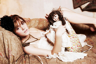
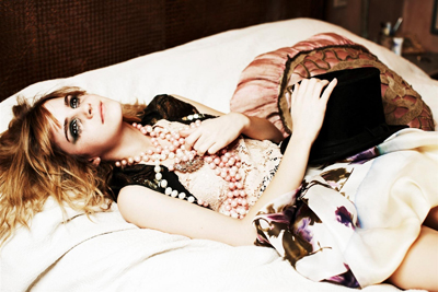
It took me three days to decide which of Ellen von Unwerth’s photos to choose. Even if you limit it down to the celebrities, there are just too many stunning ones. I decided to go for a more recent shoot with Emma Watson. Mostly because she’s been in magazines quite a lot lately, and editorial photos (and features) are somewhat annoyingly pushing the fact that she’s all grown up now. (Okay, so she is. But we got that the first time you told us, dear press. At some point that angle just gets old. And boring.) What I like about this shoot is how it plays with that media obsession with the little Harry Potter girl growing up.

Emma Watson by Ellen von Unwerth

One moment, she’s all innocent little girl, with barely-there make-up and cuddling her retro doll. Then we watch the little girl play dress-up in the bathroom, and she comes out of it as this untouchably confident young lady. And then again, she’s just a dreamy teenager, with tear-smeared mascara, her fragile body almost getting crushed under the load of feminine accessories.

Emma Watson by Ellen von Unwerth

IMHO the best attempt ever to capture Emma Watson’s transformation without annoying everybody with the oh-look-she’s-grown-up angle.

I also strongly recommend checking out more of Ellen von Unwerth’s work. There’s a new monograph, Fräulein, coming out later this month. But that’s 450 quid, so a Google image search might be the better option.

Also, my apologies for once again failing to keep it short. But at least I didn’t mention Gillian Anderson.

re:View – The Spirit (of a greater movie, half-heartedly revived)

So, I finally got round to watching The Spirit – which I was totally dying to see from the moment it was announced, and then totally missed in cinemas (along with pretty much every film that was released during my MA Year from Hell). Well, looks like I haven’t missed out, at least on this one. It’s kind of…bland. (And that’s not even a pun on the signature Frank Miller colour scheme.) I’m not even sure what it’s trying to be. It’s too clichéd to be meant seriously, and not clichéd enough to work as a spoof. And not funny enough, either.

Same for the characters. Sure those superhero movies need their ensemble of stereotypical Good Guys and Bad Guys and In-Between Guys, and Nice Girls and Evil Girls and the staple Batshit Crazy Girl… And in my humble understanding of the genre, the more extreme the opposites (and personality disorders), the better. But The Spirit‘s characters aren’t even evil or crazy enough to actually make you care which side they’re on. No development. No twists. They might fool us for a scene or two – especially the ones with an affinity to the Bad camp – with a little eccentric flair brought on by some stunning, absolutely fabulous costume design. But in the long run it all feels more like some weirdo fashion designer’s latest showcase than anything else. The costume changes are just a bit too random and incoherent to do anything for the characters, who stay rather lifeless behind all the paint and goth fluff.

The film does have some really pretty noir visuals, though. I mean, of course it does. It’s Frank Miller after all. But even the imagery gets a bit stale with déjà vu as you keep going, ‘Oh yeah, seen that before.’ The graphic novel sequences? The token colour objects? The white blood on black? It was original in Sin City. And now it’s just so Sin City. Or more like, so trying to be Sin City.

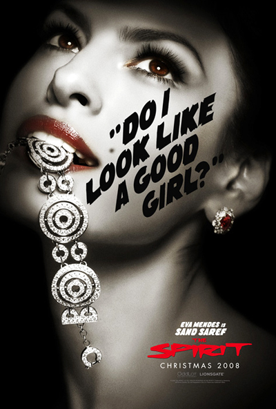
The Spirit‘s many women are probably the best thing about the film. They’re gorgeous. Really, really beautifully designed – although, again, designed as in nicely styled pictures, not as in carefully carved-out characters. Eva Mendes, Scarlett Johansson, Sarah Paulson and Stana Katic play them brilliantly – within the narrow space the plot allows them. But they could have more of an edge, a little more darkness. I mean, seriously. The Femme Fatale isn’t even bloody fatale. AT ALL. Also, none of them is quite a skinny little Nancy Callahan. But then this is not Sin City either…

Anyway, if there’s one reason for watching the film – apart from being a fan of Frank Miller’s, film noir or the colours black, white and red – this is it:

Verdict: Eva Mendes. Dressed in…diamonds. Does anything else matter, really?

Picture of the Week: Gillian Anderson for Esquire, by Rankin

It just occurred to me, while I was cleaning my kitchen, that we generally don’t do a lot of pictures on here except for the rare occason where my mind runs wild with a 60-picture movie re:View. Which is a shame really, especially because my hard drives are stuffed to the last byte with images I adore. So, I thought from now on I’ll make an effort to share one of them every week.

All right, let’s bring on the pretty pictures.

Picture of the Week #1:
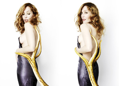
Gillian Anderson, shot by Rankin for the Esquire Augst 2008 issue.

Gillian Anderson by Rankin, Esquire August 2008

(View the full set in HQ)

Why this picture?
Well, first of all, because IMHO Gillian Anderson is one of the most beautiful people on the planet. And I love what they did with this shoot with regard to her, uhm, intense efforts to distance herself from her legendary X Files character Dana Scully. (She tends to be a bit funny about her most famous of roles and won’t even sign X Files stuff at times.) But clearly, as Esquire ran these pictures along with an interview to coincide with the release of the second X Files movie in August 2008, they had to do *something* X Files-related.

I think Rankin’s photos are fabulously playful about Gillian’s X Files history – they’re a sweet little parody of her obsession with avoiding being typecast as Dana Scully for the rest of her life. I love how they captured her nature in this shoot – which, away from the X Files set, is all contagious laughs and goofing around. The woman in the pictures, with the mischievous smile and the wild curly hair, couldn’t be further from the character on the show. And then they give her all those wonderfully cheesy props, kind of like a geeky inside joke – et voilà, we’ve got some of the most stylish and yet comic X Files promo pictures ever made.

Chosing a favourite from the shoot is almost impossible. I went for the Tentacles from Outer Space picture because it was the first that made me gasp when I opened the magazine and that wasn’t even because of the side boob…well, not only. But the picture had to fight off some tough competition from the Alien Facelift and the Naughty E.T. Nailbite!

Check back next week for picture #2. I promise it won’t be about Gillian Anderson and I will keep the rambling bit short.