Tagged: Magazines

Why you’ll see me starve before you’ll see me working for a women’s magazine

Spotted this morning on the train, in some women’s magazine (a weekly of the celebrity / gossip kind I would guess from the tasteless design) in a young woman’s lap.

On the left-hand page of a spread: Advertorial recipe feature promoting luscious-looking cupcakes.

On the right-hand page of the same spread: Huge red headline for the crash diet feature “Lose 5lb in one week!”

I’m not even going to go into the whole screwed-up body images and imposed beauty norms kind of stuff.

But still, I’m just as puzzled by the question how any editor with a shred of integrity can sign off such a spread as I am amazed that there are actually thousands of women out there who are willing to pay money to put themselves through the self-imposed emotional torture that these magazines promote.

Picture of the Week: Gillian Anderson for Esquire, by Rankin

It just occurred to me, while I was cleaning my kitchen, that we generally don’t do a lot of pictures on here except for the rare occason where my mind runs wild with a 60-picture movie re:View. Which is a shame really, especially because my hard drives are stuffed to the last byte with images I adore. So, I thought from now on I’ll make an effort to share one of them every week.

All right, let’s bring on the pretty pictures.

Picture of the Week #1:
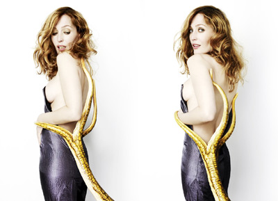
Gillian Anderson, shot by Rankin for the Esquire Augst 2008 issue.

Gillian Anderson by Rankin, Esquire August 2008

(View the full set in HQ)

Why this picture?
Well, first of all, because IMHO Gillian Anderson is one of the most beautiful people on the planet. And I love what they did with this shoot with regard to her, uhm, intense efforts to distance herself from her legendary X Files character Dana Scully. (She tends to be a bit funny about her most famous of roles and won’t even sign X Files stuff at times.) But clearly, as Esquire ran these pictures along with an interview to coincide with the release of the second X Files movie in August 2008, they had to do *something* X Files-related.

I think Rankin’s photos are fabulously playful about Gillian’s X Files history – they’re a sweet little parody of her obsession with avoiding being typecast as Dana Scully for the rest of her life. I love how they captured her nature in this shoot – which, away from the X Files set, is all contagious laughs and goofing around. The woman in the pictures, with the mischievous smile and the wild curly hair, couldn’t be further from the character on the show. And then they give her all those wonderfully cheesy props, kind of like a geeky inside joke – et voilà, we’ve got some of the most stylish and yet comic X Files promo pictures ever made.

Chosing a favourite from the shoot is almost impossible. I went for the Tentacles from Outer Space picture because it was the first that made me gasp when I opened the magazine and that wasn’t even because of the side boob…well, not only. But the picture had to fight off some tough competition from the Alien Facelift and the Naughty E.T. Nailbite!

Check back next week for picture #2. I promise it won’t be about Gillian Anderson and I will keep the rambling bit short.

re:View – How to Lose Friends & Alienate People (even without wearing Prada)

So, I mainly watched this one because it’s got Gillian Anderson and she gets to be a gorgeous, glamorous, total bitch. But by the time her character popped up on screen, I was already so thoroughly entertained by the UK’s answer to The Devil Wears Prada that I had nearly forgotten I was waiting for her appearance.

The story is, uhm, let’s say, charmingly predictable. Sidney, a young, talented British journo with a whole bunch of ideals and an even bigger ego, who specialises in pissing everybody off (hence the title), somehow gets himself hired by American’s most famous celebrity magazine. Roll on the cheesy, painfully over-used establishing shots of N-Y-C. The glitzy world of celebrity journalism, of course, isn’t at all what Sidney expected and he duly falls flat on his face. Multiply. His collection of Shoulda Known Betta experiences include pissing off all his superiors, pissing off his only well-meaning colleague (and true love-to-be), pissing off the city’s most powerful publicist, and pissing off all the celebrities. Oh, and making a complete fool of himself believing Megan Fox would actually let him get anywhere near her pants. However, in due course, he sells his soul for a trip all the way to the top (and a little closer to Ms Fox’s pants.) But just as he’s about to have it all, of course, he becomes disgusted with himself and turns his back on the corrupt world of glamour magazines in favour of his great ideals and (yawn!) true love.

So, the story certainly doesn’t win a prize (at least I hope it didn’t, or I’m gonna look really dumb), and you totally keep waiting for Miranda Priestly to come marching into the office and start ripping up throats any second. Sidney is pretty much a male version of The Devil Wears Prada‘s wide-eyed Andy, but while Anne Hathaway’s Nice Journalist Girl faded a little next to Meryl Streep’s all-eclipsing evilness, Simon Pegg’s underdog charm and hilarious comic timing allow his character to take absolute command of the the somewhat lame plot.

From the remaining repertoire of adorably stereotypical characters, Megan Fox stands out with an altogether fabulous parody of herself, and Gillian Anderson almost fills Meryl Streep’s Prada heels as the ‘Queen of New York’ – the über-dominating publicist who decides which of her clients the magazines will ‘want’ to put on their next cover.

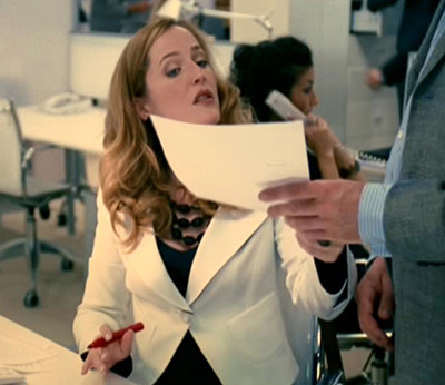
Gillian Anderson in How to Lose Friends And Alienate People
BTW: Gillian Anderson with a red pen, editing copy. Cue major obsession.

So, yeah, it’s another of those Virtuous Journalist vs The Rotten Magazine Industry films, and it’s another one based on a journalist’s memoir (Toby Young’s, in this case). But this one’s fun, fun, fun from the first minute until the credits roll, and it doesn’t make you hate yourself for still wanting to be part of that infamous magazines world by the end of it.

Verdict: It’s got all you need for 110 minutes of marvellous, lighthearted entertainment. And it’s got Gillian Anderson. And she does the Scully Eyebrow™. What more could you want?


Totally Worthless Comment: If you google Scully Eyebrow, the image search turns up two pictures from my The X Files: I Want to Believe re:View. Win!

Total Film vs Empire = Total Dilemma

Every month, I find myself faced with the same dilemma: Do I buy Total Film, or do I buy Empire?

And, no, buying both is not an option. Being a poor student with a bank account suffering unbearably from my magazine addiction, I’m obliged to enforce some amount of self-discipline with regard to my monthly magazine budget.

So, every time we get to that delightfully exciting point in the month when the new issues go on sale, you’ll find me stalking up and down in front of the magazine shelves at WHS, pulling out Empire and TF, respectively, scouring the contents, browsing the features, swapping magazines, scouring, browsing, swapping…and swapping some more.

If one contestant happens to have a beautiful woman on the cover, the battle is usually won at this point. (Yeah, I’m that easily swayed. Magazine covers with beautiful women just look too pretty on my wall.) If there are no beautiful women to be found – which is generally the case – the dilemma usually carries on for about a week and involves daily lingering in front of magazine shelves and drawing many suspicious glances from WHS/newsagents/supermarket staff.

But, seriously – how do you choose between Empire and Total Film?

So, Empire may beat TF big time in terms of sales figures. They’ve got some fabulous formats – watching the Hollywood titans make a complete fool of themselves by not being able to answer a few simple questions about their own films is just priceless. And even the Video Dungeon and those little “things we’ve learnt” blobs alone make buying the mag worthwhile. Having said that, I don’t particularly like Empire’s attitude towards people who (usually for good reasons) haven’t seen A Clockwork Orange. (Basically, in that case, you’re not worthy of the mag.) And, no, I’ll never get used to the orange/red/brownish design on the reviews pages. Blech!

Total Film
, on the other hand, may forever be cursed with a life spent in Empire‘s shadow. But it’s way more than the cooler little brother. For one, TF is published by the country’s most awesome publisher, Future (who I totally want to work for – and that has nothing to do with the fact that they’ve got a life-size Lara Croft and Captain Jack Sparrow in their London branch cafeteria). The mag is gorgeously designed from cover to cover – the features layouts make me howl with envy every month – and you just got to love the TF folks’ delightfully wicked humour. Then there’s the wonderful randomness of the Predicted Interest Curve™ and the “If You Must…” film chart, along with tons of other weird, wonderful, random little formats. And, rather than make me feel ashamed of what I don’t know about films (sadly all too often the Empire approach), Total Film throws in lots of little bits of essentials and trivia that just make me love films a little more every month.
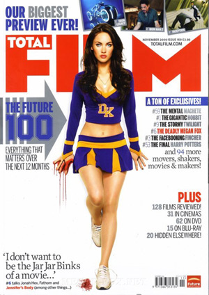

The very promising November 2009 Total Film cover. And I’m not even talking about Ms Fox here…

I guess the point I’m trying to make here is that I usually buy Total Film. Unless Empire comes up with a total stroke of genius – like this month’s ’10 Years – 10 Covers’ Icons Issue:
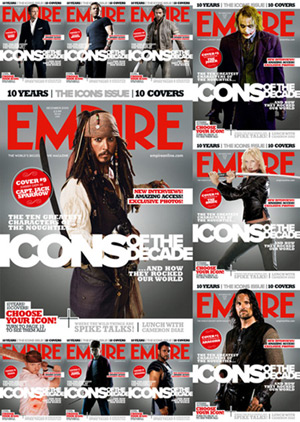

Empire sets out to impress this December with 10 different ‘Icons of the Decade’ covers. Considering the men/women ratio in their choice of icons, I very much doubt they’ll impress anyone with so much as a single feminist gene though.

Which meant that, this time, I spent my magazine shelves lingering time shuffling through the stack of issues trying to decide which Icon of the Decade I’d like to grace my fabulously shiny metallic-y cover. Aragorn? Wolverine? James Bond? Somewhat upset about the lack of female icons (one out of ten? You’ve got to be kidding me!) I decided to go for the Joker, only to find that all the Heath Ledger-fronted issues had already been snatched up. So I settled for Jack Sparrow, who actually does make a pretty fabulous iconic cover – if you can get over the fact that the silly yellow “security protection” sticker would only come off stripping half the metallic coating off the cover along with it.

Anyway, thank you, Empire, for my somewhat ruined but still rather cool second-choice icon cover.

And to my great embarrassment I have to confess that, with all the excitement of 10 shiny covers to choose from and all, I somehow totally can’t remember what TF had to offer on the December issue. But, well, I’ve still got a couple of weeks to catch up on that before I have to face next month’s dilemma…

I made a magazine

Here’s some of my student magazine work. Or rather, my very own magazine – a dissertation project on the MA Magazine Journalism course at Sheffield Uni.

Unite – the magazine for parents of teenagers.

Click on the cover to get to the full PDF.